Thirteen years designing for the complicated stuff — epidemiology, compliance frameworks, mental health, benefits nobody reads. Five of them at the CDC. I make it clear, accessible, and occasionally funny. Nothing ships without a fact-check and a contrast ratio.


Sometimes the design is fine and the message is wrong. Sometimes it's the other way round. I start by working out which — then I do the work, not the deck about the work.
Identity, voice and a brand book non-designers can actually follow. Built so the tenth person to use it doesn't need me in the room.
What's included →Designed and built in Webflow. Messaging hierarchy first, accessibility from day one, animation only where it earns its keep.
Site design details →A monthly retainer for teams that need a designer who already knows the context — campaigns, decks, editorial, illustration, the lot.
How it works →Accessibility isn't a service line, it's how I work. Section 508 and WCAG 2.2 AA are designed in from the first sketch — because retrofitting contrast at the end is how projects die.
Written up properly: the brief, what made it hard, the decisions, and what happened after.
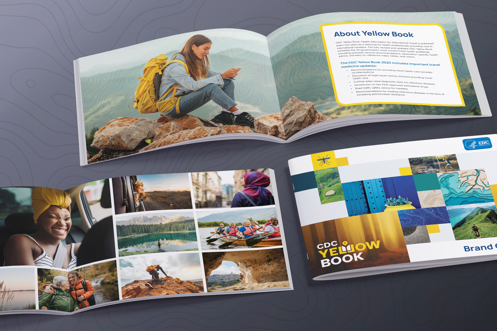
Logo, visual identity and design system for the travel-health reference clinicians reach for first — a 23% lift in unique visits and the Excellence in Communications Award.
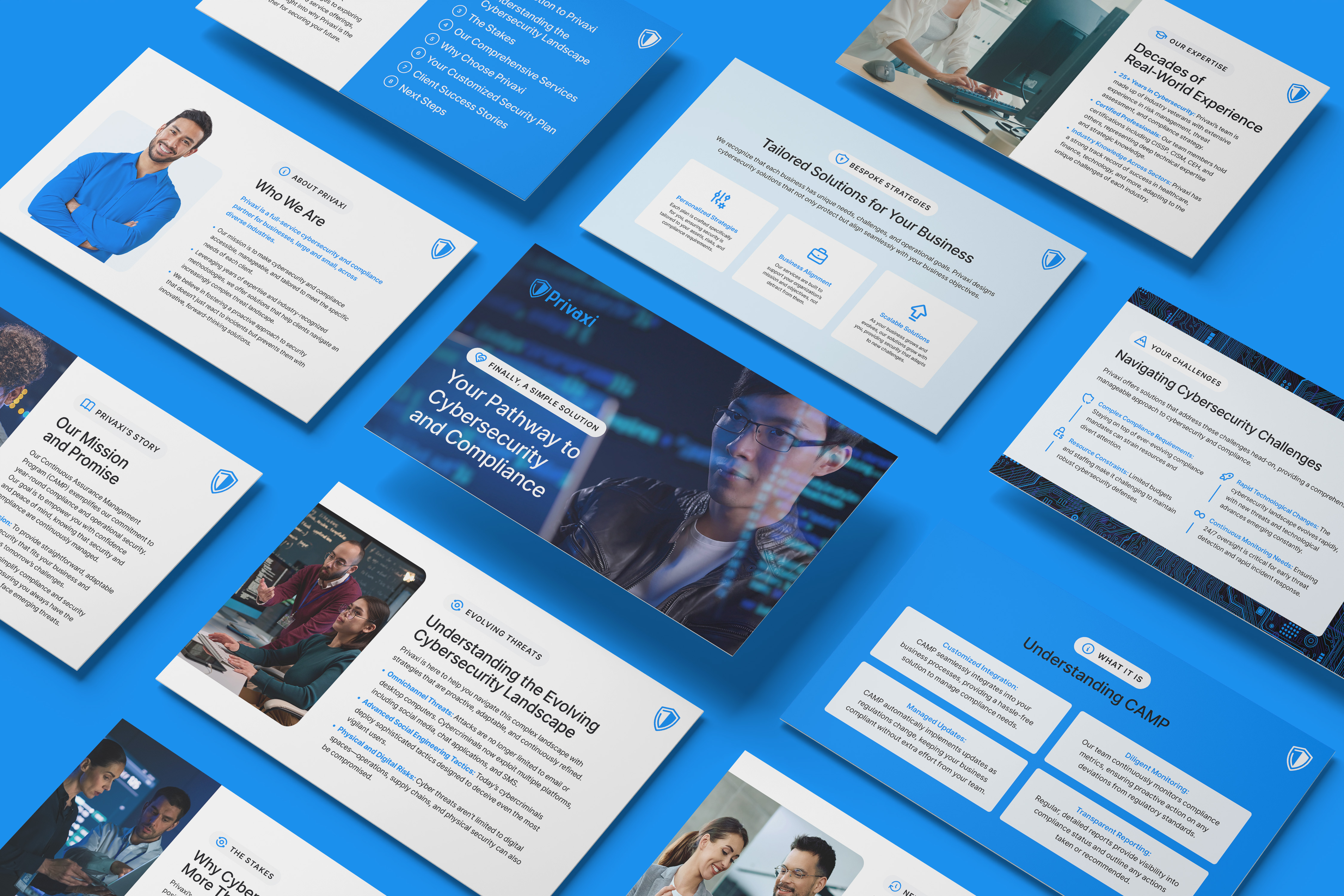
SOC 2, ISO 27001, HIPAA, HITRUST, PCI-DSS, CMMC. Six frameworks, one buyer who isn't technical. I built the messaging hierarchy and the system that carries it.
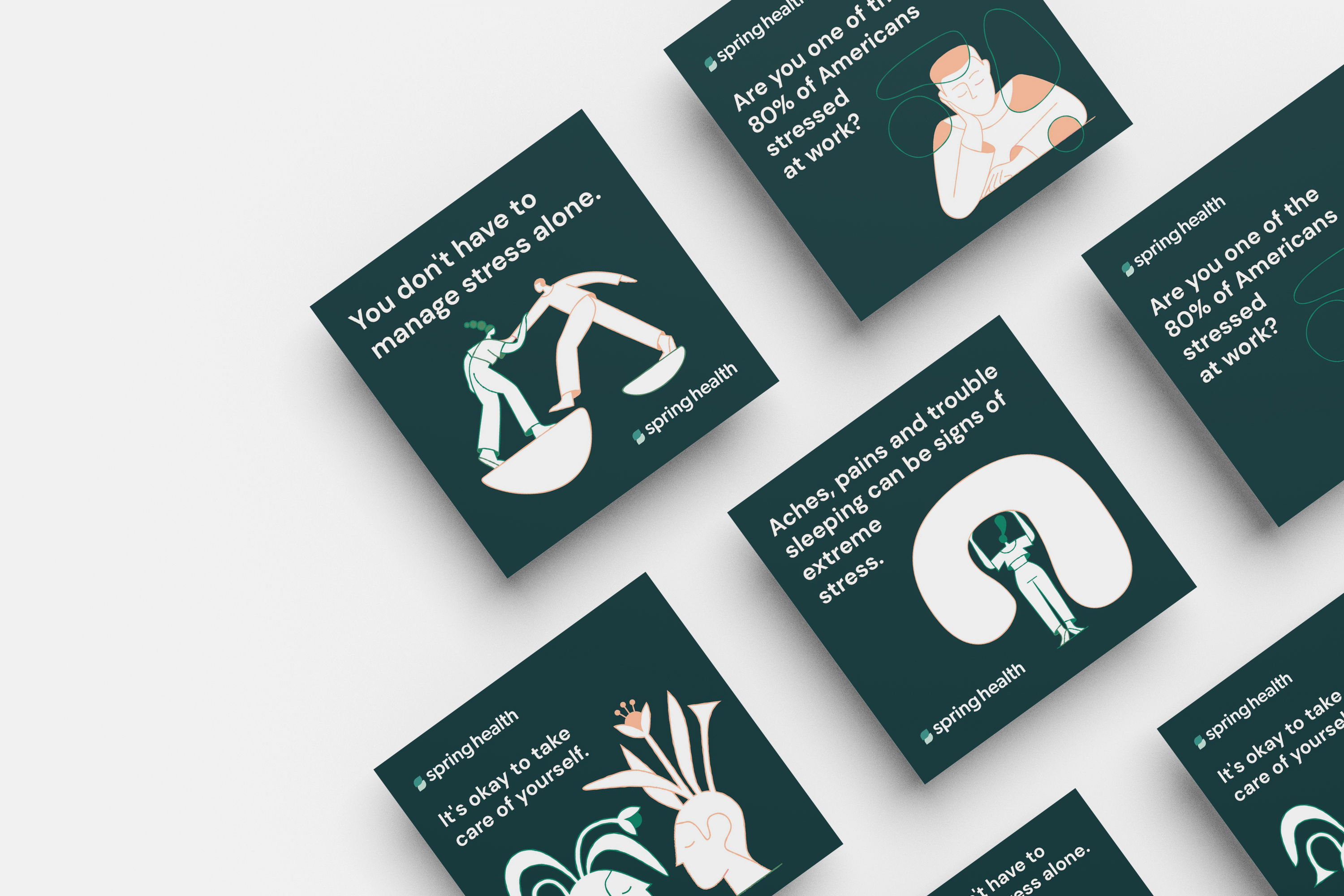
A two-year design partnership with a national mental-health benefit — campaigns, web, ebooks and social, warm enough to be human and systematic enough to ship.
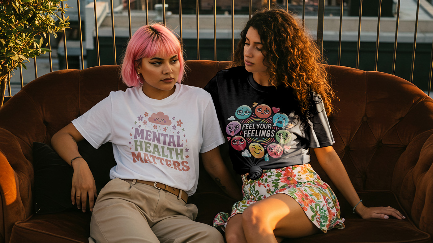
Founded, drew, branded and shipped it. 480+ backlinks, national press, and $13K+ monthly revenue at 26% net profit. Proof I can run a brand, not just design one.
Most design problems are unresolved decisions wearing a visual costume. So we settle the decisions first — then the design is almost easy.
I learn your subject well enough to argue about it. Whether it's a compliance framework or a treatment pathway, I'd rather be the designer who asks the annoying question in week one than the one who guesses in week six.
What does the audience need to believe, and in what sequence? That hierarchy becomes the layout, the type scale, the whole system. Accessibility constraints go in here, not at the end.
Files organised, patterns documented, examples of the wrong way as well as the right one. The measure of a good system is how little it needs its author.
I'm Alyssa — a designer, brand strategist and illustrator in Fort Lauderdale. Advertising and marketing at Florida State University, a master's in communications and digital strategy at the University of Florida, plus one class away from a web design certification, because apparently I can't stop.
Five of those years were at the CDC as a Senior Brand Designer and Art Director, setting visual identity and design systems for a scientific institution. Every job I've had has served public health in some form — epidemiology, benefits, mental health. The medium changes; the mission doesn't.



“Alyssa contributed to many of the branch's most visible initiatives, including the CDC logo refresh, the redesign of the CDC Yellow Book, and the Global Health branding campaign. She is one of those rare creative professionals who combines talent, curiosity, generosity, and discipline in equal measure.”
“Alyssa is outstanding. If you value a designer who is timely, has attention to detail and is pleasant to work with, she is your designer. I am very pleased and will be hiring her again.”
“Fast delivery, excellent communication, and she executed on our vision even better than we could have imagined. Would jump at the chance to work with her again.”
Notes on making complicated things clear — accessibility, brand systems, and the occasional strong opinion about contrast ratios.
I'm Alyssa Ostroff — designer and brand strategist. Open to senior design and creative lead roles at mission-driven teams, and taking two freelance projects this quarter.